Overall a packed keynote with lots to say, here are my highlights.
iCloud Drive is looking to take on Dropbox and SkyDrive, with Windows clients too.
CloudKit looks to be something similar to Microsoft’s Windows Azure Mobile Services, but free. Will it support non-iOS clients, though?
HealthKit and HomeKit look interesting, as long as they don’t go the same way as Game Center.
Finally, we have unified communications between all your devices. Receive SMS on your PC, make phone calls from an iPad. Great stuff.
With widgets in the sidebar and lots of translucency, I couldn’t help but think of Windows Vista when I saw Mac OS X 10.10. I joke of course, though I will miss the 3D dock.
The new Spotlight service looks like it will be extremely useful, and could reduce iOS/Mac OS users’ reliance on Google.
The new photos in the cloud service should really help me with my measly 16GB device. Can’t wait for the Mac version to be released.
Objective-C replaced! I was not expecting that. Great to see a more modern language being introduced.
As anyone who owns a MacBook air will know, these amazing laptops fall down in one key area – storage capacity. Of course you’re free to plug in an external hard drive to get extra space, which with USB 3 will be super snappy. External hard drives are a bit clucky however, especially when you want a laptop to be portable and easy to use say, on you lap.
Luckily, the 13 inch MacBook Air models have an SD card slot, so it is possible to add in an SD card and gain additional storage that’s easily portable. The problem with most SD cards is they extrude from the side of the laptop – meaning anyone who leaves a card in all the time is likely to damage or loose it.
Enter the Nifty MiniDrive
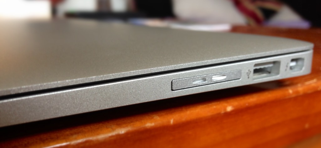
The Nifty MiniDrive looks great when inserted into my 2013 MacBook Air
The nifty MiniDrive promises to solve this problem by offering a microSD adapter that fits into the SD card slot. Unlike a normal SD card, it sits flush with the edge of the MacBook. What a brilliant idea. For £76.87 was able to increase the storage on my MacBook by 50% by ordering the Nifty adapter along with a 64GB microSD card – a bargain right? It depends…
Really slow
When I tried to move my 20GB iPhoto library on to the drive, iPhoto crawled to a halt and was unusable. I’m pretty tech savvy and so I of course took this on as a challenge and spent quite a lot of time trying to solve this; by rebuilding photo thumbnails, repairing permissions, making sure the drive was formatted HFS+, and even rebuilding my library from scratch. In the end I came to the conclusion that the microSD card supplied was simply not up to the job.
Battery Life
One of the best features of the MacBook Air is the ability to leave it in sleep mode for days on end without the battery draining much. I noticed after I’d started using the MiniDrive that my battery seemed to go down a lot while it was in sleep mode. After some digging, I discovered that Mac OS X will put the laptop into a “deep sleep” mode (similar to Hibernate on Windows) after a few hours in normal sleep to save on battery life. The problem I found is that Mac OS X will never do this if an SD card is inserted. That means standby time is significantly reduced when the Nifty MiniDrive left in, and the while point of the Nifty MiniDrive is that you leave it in. I must stress this is not the fault of the Nifty MiniDrive (any SD card will cause this to occur) but I was surprised to see it wasn’t mentioned on their FAQ page, as it could be a problem for some people.
So what’s it good for?
iTunes and Steam
I found it was quick enough to store my iTunes library on, and Steam had no trouble storing and loading games on it. Team Fortress 2 ran absolutely fine from the Nifty MiniDrive. For anyone with a MacBook bursting at the seams with games and music, the MiniDrive is probably worth getting. You could also theoretically move your Dropbox or OneDrive folders onto the drive.
Backups
Another often quoted use of the Nifty MiniDrive is as a Time Machine backup drive. This can work well in theory if you want to make use of Time Machine’s versioning features, but as a total backup solution, having your backup inside your laptop at all times means if your laptop gets lost or stolen then so does your backup, so for me this was a non-starter.
Worth buying?
So would I recommend the Nifty Minidrive? My answer is yes if you’re aware of it’s limitations. For people who routinely shutdown their Macs instead of using sleep, they shouldn’t notice any big changes in battery life. If you need to store large, rarely used files then you shouldn’t notice the performance issues either. Hopefully the next version of OS X will iron out the battery life issues, and faster microSD cards will be released in the future, making it a good investment.
Remember when the iPad first came out in 2010, and the first thing everybody said was it was doomed because it didn’t have Flash? Well, it turns out most web site owners were able to accommodate this requirement, and these days even Android tablets and phones lack the once ubiquitous browser plugin. Yet, if you’ve ever browsed the web on an iOS device or an Android device (the chances are you have) you’ll know that in the vast majority of cases, everything has continued to work as normal. Staples of the Internet from BBC News to YouTube keep on working - when it comes to video at least (if you want to run Farmville sans plugin then you’re out of luck).
So when setting up my MacBook with a clean installation of OS X 10.9, I decided to see if it was possible to live without Flash. My guess was it would be, and why not? One less thing installed on your system means a reduced attack surface for malware, fewer processes running and hence better longer life, and in my experience, fewer browser hangs. I was wrong however - instead of using “feature detection” (as good web developers should) to determine whether the browser supports the Flash alternative to video, “HTML5 Video”- it seems the vast majority of sites employ user agent sniffing and will only show you the non-Flash version if you’re on a known mobile device. I kept on being asked to install Flash, even though my iPad works just fine without it. User agent sniffing is the reason why sites designed for IE6 will ask you to “upgrade” if you visit in IE11 -I can forgive any web developer working back when IE6 came out in 2001 for following what was then a standard industry practice, but User Agent Sniffing is now generally considered outdated, so why are so many sites still doing it when it comes to playing video?
I was lucky enough to be bought an Xbox One for Christmas, so I thought I’d post some of my initial thoughts.
The games look amazing
I have one game (Forza 5) and at £50 a pop I will likely only have one game for many months to come. That said, together with the new controller that has vibration motors in each trigger (lets you feel feedback from the brakes), speeding around Circuit de la Sarthe has never felt so real. Whether it’s being blinded temporarily by the sun, or seeing a glimpse of the driver in the windscreen, it just feels so real.
The Interface is Confusing
While I wanted to love ‘Metro’ on the PC, after trying it for just over a month on my main development machine, I had to revert to using Start8 – it didn’t work out for me (loved it on the Surface RT, however) – so how does it stack up on the Xbox One? My view is that it could work, but the current execution isn’t great. On the main screen the positions of apps move about too often, so it’s impossible to remember where anything is. After a while I realised the tiles on the main screen amounted to a ‘recently used list’ the with exception of the left and right columns, which are fixed. There’s no visual differentiation, barley any visual hierarchy (the currently running app is the largest, everything else just looks like it was thrown in) and so it all gets rather confusing. To get to Settings for example, you have to go to ‘My Games & Apps’.
Apps for the sake of Apps
No device these days would be complete without an ‘App Store’ – however the Xbox One has taken this to extremes. For example, if you’re in a game and you get an achievement, in order to see the full details of that achievement you need to leave the current game and open another app (complete with an awful “splash screen” which makes the effect of leaving one app and going to another feel even slower), if the Xbox 360 could do this, surly the Xbox One should be able to? Another example of this was when browsing the video store, in order to view ‘TV Deals’ I had to install the Xbox Video app. It seems a bit ridiculous that this isn’t just built in.
Kinect is impressive if still work in progress
Having Kinect recognise you and automatically log you in is very clever. The speech recognition however is limited. Unlike Siri on an iPhone you need to keep to a precise syntax, and it’s not very forgiving. Say to Siri “Hello my friend, could please turn on the Bluetooth thingamajig” and it will turn on the Bluetooth radio. Ask your Xbox to “switch off” rather than “turn off” and it does nothing. I really hope this gets improved. That said it is still very useful, especially the “record that” function that lets you record the last 30 seconds of gameplay and share it online. I can’t imagine using the Xbox One without the Kinect plugged in, it just feels like work in progress still. I don’t have any Kinect games, so I can’t comment on how good it is for games, which I guess is its main purpose after all.
Everything is fast and fluid, it multitasks like a dream
The Xbox 360 despite being able to render Skyrim at a decent frame-rate was seemingly unable to load a simple system menu without a few seconds delay. Game updates would block the entire interface and it just felt very sluggish, The Xbox One however always feels snappy. Even mid game I was able to press the ‘home button’ and get straight back to the Start Screen, compete with a smooth transition and sound effect. Subsequently opening an app such as Skype or Internet Explorer was very quick. I was also able to install a demo from the store and keep playing. I hope it doesn’t slow down over time, but this fluidity will do a lot to tempt me to use the Xbox One rather than the Apple TV or Virgin TiVo box to access Netflix or rent movies etc
The best is yet to come
I hope (and predict) Microsoft will keep updating the Xbox One as they did with the 360. I’ve only used it for a couple of days so far and you can only fairly judge a a games console after many months of usage. Overall I’m very pleased with it, and look forward to more exciting releases.
I was talking with some folks over lunch about past phone’s I’ve owned. I’ve raided my memory and decided to put up ‘my history in phones’. What do you think?
2000: Ericsson A1018s
All I remember about this was it came free when you saved up enough Coca-Cola ring-pulls. Thankfully a friend of the family drank a lot of Coke. Back when this came out, all a phone could do was literally make calls and send texts. Unusual for its time, this model could store SMS in its own internal memory as well as on the SIM.
2001: Motorola T191
Wanting something a bit more stylish, I blew one my early paycheques on this baby. It made calls, and could send and receive SMS. It had a cool little ‘Bick’ came too. The vibrate motor was pretty substantial.
2002: Nokia 3330
Realising everyone else in my family (and the world) seemed to have a Nokia, I went for the 3330, they must be good – right? The 3330 was to the 3310 what was the iPhone 5S to the iPhone 5 – more memory and WAP in this case. More memory meant more space for custom icons, WAP meant getting football scores from the BBC on your lunch break.
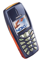
2003: Nokia 3510i
Nokia had the best interface and the best battery life, so I stuck with them for my first colour phone. No camera, the colour screen was only for receiving MMS messages as I sure was going to be sending any without a camera. It used to lightup like a nightclub when it rang, great phone and served me well for many years after as a ‘backup phone’ for taking to festivals and places where it’s likely to get ruined.
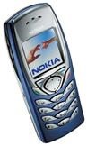
2004: Nokia 6110i
While it might be cool to have the biggest phone possible these days, back in 2004 having the smallest was what it was all about. Not much of a change from the 3510i except mobile browsing was improved, and it let me share internet out to my PDA via infra-red.
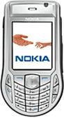
2004: Nokia 6630
My first smartphone. It was also my first 3G phone and was capable of making video calls, although it had no camera on the front. Instead it came with a desk stand that would allow you to point the rear camera at yourself. The on-board software was pretty amazing for its time – email, browsing, MP3 Support, even a little app that would put photos and video together into one long video and with background music (iMovie does this to this day). Two phones in one year? I think I took out some form of insurance that allowed me to return my phone and get a new one anytime I liked (at the expense of getting a new phone number, unfortunately)
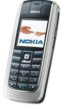
2005: Nokia 6020
While I had enjoyed my first foray into smartphones, I the 6630 was underpowered and something as simple as opening the Contacts app would take about 10 seconds. So I decided to switch back to a ‘classic’ Nokia. By now Series 40 phones had quite a few smart features themselves: background email checking, mobile web browsing, ‘Push to Talk’ to name a few.
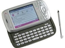
2005: MDA Vario (AKA HTC Wizard)
The geek in my needed a smartphone, this one ran Windows Mobile 5. It was very cool, it had a full keyboard and meant you could do really advanced things for the time such as connect to a WiFI network (!), crop photos, run an RDP session to your PC and edit Office documents. Unfortunately unlike a Nokia, the alarm could not be relied upon to wake you up in the morning – it would regularly fail to go off or crash. I remember spending a lot of time hunting for jobs when I had this phone, and having a decent email client really came into its own. The stylus used to keep falling out, eventually I lost it I think.
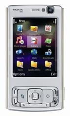
2007: Nokia N95
This was the phone to beat all phones: WiFi, GPS, HD Video and 5MP Carl Zeiss camera with an optical zoom (not just digital zoom as most phones to this day still have). The podcasts app was great, so was email and browsing the web (it would show desktop sites and allow you to zoom). It did get slow after a few years of use however, and the volume up button broke twice for me (after 1 replacement). This made me decide not to go with Nokia again.
2001: iPhone 3GS
Probably my favourite phone looking back, because it did change the way I used my phone. I already owned a first generation iPod Touch, and so I was completely sold on iOS. The App Store, easy video editing, games – everything was a joy to use. For the first time I would use my phone instead of a laptop for casual web browsing. Not to mention it was also an iPod. Brilliant, although iOS 4 did slow it down somewhat, it was at its prime when running iOS 3.
2011: HTC Desire S
I thought it’d give Android a try – everything was just slower, uglier and less reliable than the iPhone.
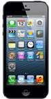
2012: iPhone 5
After about 18 months using the HTC, I just had to jump ship and go back to iPhone. It’s easy to use, the battery lasts forever and it has more apps that I could download in an entire lifetime. I’m undecided on iOS 7, although I’ve yet to use it day-to-day. Looking forward to installing it, although I will probably wait a month or so for the bugs to be ironed out.
Where Next?
Whatever happens my current phone will have to last me least another 18 months, whether I get the iPhone 6 or switch to Windows Phone 8 depends… all I know is that I’m unlikely to switch back to Android – although I would consider a Nokia again, having played with some of their newer (much more sturdy) phones.
I bought my Samsung laptop well over a year ago, and it came running Windows 7. Despite having the most awful keyboard I have ever used, I’ve stuck with it because the Core i5 is pretty decent, and it’s got plenty of storage for all my music and I’m not going to shell out for a new laptop until this one gives up the ghost.
One of the interesting features that Samsung included was a piece of software called ‘Easy Settings’ which allowed me to configure the battery to never charge above 80%, supposedly lengthening the life of the battery. I turned this on (since my laptop is plugged in 99% of the time) and forgot all about it. A few months later I installed Windows 8 and found that Easy Settings no longer worked. When I tried to install it I got this message:
Loosing 20% of your battery capacity might be fine around the house, but sometimes I do like to take my laptop out and so I really wanted to be able to configure this. Even forcing Windows to install meant the app would run but wouldn’t display correctly function at all, I guess Microsoft blocked it for a reason.
Install Version 2.1
It turns out Samsung do offer a version of this tool for Windows 8, they just don’t make it easy to find. Version 2.1 works perfectly fine on NP300E5A model. Before I could change any power management settings, I had to update my laptop’s firmware however. The link to the download was hidden away on this Windows 8 update page, so check your model is listed before performing any firmware updates!
One nice addition if the ability to turn your laptop into a wireless Access Point (yes, Macs have had this feature for years I know, and it’s very useful).
I decided to upgrade my Kindle Keyboard to the new Kindle Paperwhite. I wouldn’t usually replace a device so soon (just two years after buying it), but my girlfriend was thinking of getting the basic £69 Kindle. I used that as an excuse to let her have my old one so I could try out the new model with the built-in light.
My first impression is that the lighted screen is beautiful to read from, and it makes it easy to read in complete darkness. That’s the real benefit here. Whether in bed at night or outside in the sun, the screen looks great. You may read reviews complaining about some unevenness in the lighting along the bottom of the screen. Yes, I noticed that, but it’s really not an issue, since that part of the display only shows progress information, not the book’s text.
Unfortunately, the touch screen is a major step backwards for page turning. Instead of two large buttons on each side of the device for backwards and forwards, there’s an invisible grid on the screen: tap on the far left to go back, tap in the middle or right to go forwards, and tap at the top to bring up the menu. It feels clumsy and keeps this device from being the perfect reading tool. The touch screen does make the virtual keyboard easy to use, so buying books is much simpler. However, I spend about 0.0001% of my time on the Kindle inputting text, so I’d be happy to do without that. I often find myself losing my place in a book because I’ve gone forwards instead of back by mistake.
So I’m mixed about this one. A great screen, but missing physical buttons. I guess Amazon needs to save something to tempt people into upgrading again next year 😉
The BBC have been running a story this afternoon about e-book sales vs printed book sales. I was surprised when a majority of the people they (unscientifically) surveyed said they preferred printed books. This was not because they can be purchased second hand for next to nothing, not because they make a great gift or because they can be passed along to a friend, but because of the way they ‘feel’ – really?
I have never finished a great book and been absorbed for days by the texture of the book in my hand – a satisfying plot, however has made me do just that – and digital advances can improve the reading experience by offering custom fonts, synchronsiation, character profiles, built in lights, and being easier to hold. I’ve probably converted about 4 people I know who said they loved the smell and feel of printed books to e-readers, because good story is what makes a good book, after all.
So the in thing these days is for tech pundits to declare that an app centric ecosystem is old fashioned, and that what people really want is a people centric ecosystem; witness Facebook Home, and Windows Phone 8 before it.
That’s all well and good, but do app developers want their brand to be muffled into another system? I think most developers like having their icon on the home screen, like being able to design their app as they see fit, and wouldn’t be happy if the operating system simply surfaced their content as part of a people centric approach.
Ecosystems are nothing without the support of developers and big brand apps. Everyone wants their cut of the ‘mind share’ pie.
Windows 8, by trying to be like iOS and Android and providing a simplified “one app at a time” interface (or more precisely 1.3 apps at a time) means that Windows is no longer good at what Windows was always good at. I already have a tablet, and I reach for my Windows laptop when I need to do something my iPad can’t. That inevitably means I head straight to the desktop. This is why Windows has failed to reinvigorate the PC market, Windows no longer offers a great desktop experience or a mature tablet experience. I’m sure it will get better, and really hope we see Office for Metro sometime soon.