This surge was partly driven by a widespread misconception that embedding-based similarity search was the only viable method for retrieving context for LLMs. The resulting “vector database gold rush” saw massive investment and attention directed toward vector search infrastructure, even though traditional information retrieval techniques remained equally valuable for many RAG applications. … However, the landscape has evolved rapidly. What started as pure vector search engines now expand their capabilities to match traditional search functionality. Vector database providers have recognized that real-world applications often require more than just similarity search.
I’ve never quite understood the hype around using similarity search to retrieve content for a RAG system. Yes, cosine similarity can be useful in certain situations, but in many cases, there are better ways to find the right content. This is especially true when the user’s question has little semantic resemblance to the answer. Not to mention when you have potentially multiple versions of the same documents that may or may not be relevant depending on the context of the question. Now every major database supports vector search, is there even a need for a dedicated product? I’d recommend giving the latest episode of the Latent Space podcast a listen where they explore these issues, and alternatives, in more depth.
A major journalism body has urged Apple to scrap its new generative AI feature after it created a misleading headline about a high-profile killing in the United States.
The BBC made a complaint to the US tech giant after Apple Intelligence, which uses artificial intelligence (AI) to summarise and group together notifications, falsely created a headline about murder suspect Luigi Mangione.
The AI-powered summary falsely made it appear that BBC News had published an article claiming Mangione, the man accused of the murder of healthcare insurance CEO Brian Thompson in New York, had shot himself. He has not.
I’ve worked on implementing AI into software products for the past seven years, and the first rule is always to start with a narrow domain, carefully assess how effective it is, and, if your approach is working, gradually expand your domain coverage. When it comes to notification summaries, I can’t help but wonder why Apple didn’t adopt this approach. Instead, they’ve delivered something that feels more like a hasty student project than the polished innovation we’ve come to expect.
Specifically, I would have started by limiting the product to summarising notifications where summaries are genuinely most useful. Of course, not being a product manager at Apple, I haven’t done the research, but let’s assume messaging apps would top the list. A “TL;DR” summary for lengthy WhatsApp group chats, for instance, could be genuinely valuable. On the other hand, attempting to summarise product promotions or delivery notifications from Amazon, breaking news, or even the alerts I get when my wife logs a feed on our baby-tracking app feels far less useful. Most of the complaints I’ve seen online seem to involve apps like BBC News, Amazon, or other non-communication apps. Apple would be better off avoiding attempts to summarise these types of notifications and instead focusing on apps where summarisation truly adds value: messaging apps such as WhatsApp or Slack.
That’s not to say the current implementation is flawless when it comes to messaging apps either. In an example shared by WSJ technology journalist Joanna Stern, the iPhone mistakenly assumed her wife was referring to a non-existent husband. The issue likely arose because Stern has her wife saved as “Wife” in her address book. The smaller language model onboard the iPhone, relying on statistical assumptions, concluded that someone called “Wife” must be referring to a husband when mentioning another unnamed person. It’s exactly the sort of edge case1 that could have been caught more easily during testing if the first version had maintained a laser-like focus on summarising messaging app content.
By starting small and focusing on where summarisation adds the most value, Apple could have delivered a more refined and impactful feature, avoiding many of the issues we’ve seen reported .
A swing-and-a-miss from MKBHD. Criticism of the app is on two separate levels, but they’re being conflated. Level 1: the app is not good. Level 2: a paid wallpaper app? — LOL, wallpapers are free on Reddit. That second form of criticism — that there shouldn’t even exist a paid wallpaper app — is annoying and depressing, and speaks to how many people do not view original art as being worth paying for. But it also speaks to the breadth of Brownlee’s audience, which I think is more tech-focused than design-focused.
What’s even more annoying and depressing is the inability to separate the appreciation of art from the act of commerce. Perhaps people didn’t expect someone reportedly already making millions to charge so much for so little. The app description mentions “teaming up with top-tier digital artists,” so it’s not as if it’s even showcasing lesser-known artists who might benefit from the app’s exposure and thus warrant some philanthropy. Gruber is wrong here. You can appreciate good design while also thinking £12/month is a rip-off.
On Monday, software developer Michael Sayman launched a new AI-populated social network app called SocialAI that feels like it’s bringing that conspiracy theory to life, allowing users to interact solely with AI chatbots instead of other humans. It’s available on the iPhone app store, but so far, it’s picking up pointed criticism.
A social networking app where you are the centre of the universe, surrounded by bots constantly providing you with positive reinforcement and worshipping your every word. Elon Musk must be kicking himself – he could have saved $44 billion.
I was recently trying to compile a .NET project as a self-contained binary for linux-arm to run on my Raspberry Pi. When trying to run the binary, I kept getting the following error:
/usr/lib/arm-linux-gnueabihf/libstdc++.so.6: version GLIBCXX_3.4.26' not found (required by ./[executable])
It turned out the issue was caused by using .NET 9. Downgrading the project to .NET 8 resolved it. I’m unsure whether Microsoft or Raspbian needs to address compatibility with .NET 9, but as it didn’t impact my code, it wasn’t a problem for me.
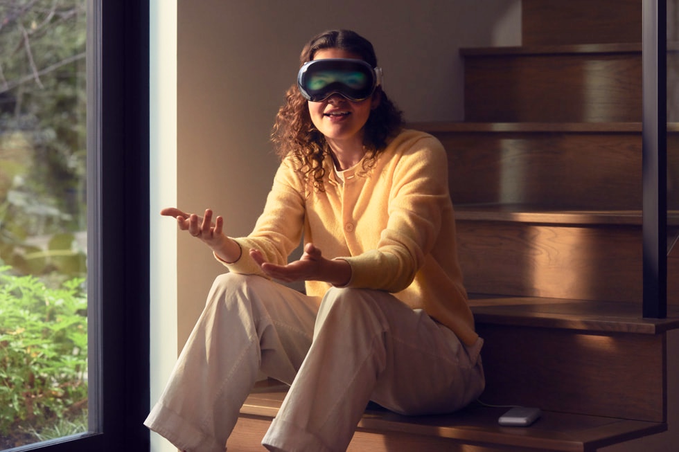
Three and a half months after the release of Apple Vision Pro, and I am finding it difficult to get on board with Apple’s vision for the future of computing. While admittedly I haven’t tried the Vision Pro due to it not being available in the UK, and I’m sure I would be momentarily wowed by the experience, I just can’t get excited about what I see as a deeply dystopian vision of the future.
Let’s start with the vision itself. We spend too much time on screens as it is. Endless doomscrolling and the inability to switch off are widely believed to be behind rising anxiety and depression. Apple, to their credit, has attempted to remedy this with features like Screen Time which allow limits to be put in place. The very concept of the Vision Pro goes against this progress. It’s a screen strapped to your face. Right now, the discomfort of a hot and heavy device acts as a deterrent against using it too much. My worry is that as technology progresses and much like the smartphone, the Apple Vision Pro will get lighter and more comfortable — more addictive. If the headset follows the path of the smartphone, then it will eventually be something we want to wear as much as possible. We live in a world of filter bubbles. If you use Twitter (sorry, X), then your view of reality can be vastly different from your next-door neighbour who also uses Twitter, due to the fact that you both like and follow totally different posts and sets of people. Smaller social networks don’t need an algorithm to do this as they will typically only attract people of a certain political leaning in the first place. The end result is the same. Filter bubbles are an obvious problem for social cohesion, and while they are not limited to social networks (hello Fox News), I can’t help thinking that when literally everything is viewed through a screen — yes, your entire reality — the problem will only get worse. If you’ve seen Black Mirror, then I don’t need to explain why, but let me anyway. Imagine an app for a future revision of Vision Pro (or its rivals) that can be worn all day. The app allows users to employ Twitter-style blocking, so the faces of people they would rather not see are blurred out. Could someone with right-wing views use an app to blur out TV screens showing CNN or the front page of the New York Times, allowing them to walk down the high street and not be bothered by reality, or what they consider dissenting opinions? In 2020, as California was struck by awful wildfires, people noticed something strange. Their smartphones were automatically adjusting the apocalyptical red-tinted sky to look more “normal.” The image of humans using VR goggles to deny climate change or insert virtual green spaces into an otherwise industrial wasteland is just terrifying. In short, I am deeply worried about a future in which our entire reality is seen through the filter of a screen. The Apple Vision Pro can’t do any of this right now, and I doubt Apple would ever allow it to. Yet as the Twitter/Musk debacle shows us, the people who run companies can change, and their policies with it. Not to mention that if the Apple Vision Pro were to be a success, then there would naturally be rival products released which may not be as restrictive.
All of what I’ve said so far is admittedly far-fetched, and perhaps assumes the worst of humanity. So let me focus on the Apple Vision Pro as the product it is today. Apart from being deeply antisocial, the main problem I see is that it is an iPad strapped to your face but priced as if it were a fully-featured MacBook strapped to your face. The iPad and tablets, in general, are great content consumption devices, but the limitations inherent in mobile operating systems make them poor substitutes for a laptop. Samsung and Apple have taken steps to address this, including making the iPad more like a laptop with the addition of support for trackpads, mice, and keyboards. Yet the apps themselves are more often than not baby versions of the same applications available for desktop operating systems, if an app is available at all. There are exceptions — Logic and Final Cut Pro. Overall, it seems a combination of iOS (sorry iPadOS) limitations, Apple’s greedy business practices, and the poor ergonomics of tablet devices has contributed to the iPad not taking off in a productivity context, outside some niche verticals. By designing the Apple Vision Pro’s software stack in the image of the iPad, the device is unfortunately severely limited. Had the device been based on macOS, with the ability to run Mac software, then it would be a completely different story. I understand that technical limitations likely prohibit this: the accuracy of Vision Pro’s gesture recognition simply isn’t good enough to allow Mac apps designed for use with a mouse to be comfortably driven. Which brings me to my final criticism. One of the most touted features of the Vision Pro is the ability to VNC into a desktop Mac and control it remotely. The fact that this was pushed as a feature is the most damning indictment of the Vision Pro’s capabilities as a computing device. A proper computing device worth its $3,500+ price tag wouldn’t need the ability to remotely connect into your other $2,000+ laptop — it would be as capable itself. On various forums I’ve seen happy Vision Pro customers tout the ability to work on a plane for hours on end with both their MacBook and Apple Vision Pro. Here we go again with the dystopian future: can someone not take a flight for a few hours without needing to be productive? For goodness’ sake, read a book, listen to a podcast, or just look out of the window!
So, while the nerd in me is ready to be wowed by the Apple Vision Pro, I find myself despairing as I think about a potential future where we are always plugged in, online, and unable to escape work. I can’t help but think this isn’t what technology was supposed to be about. I have to ask myself, would the figure from Apple’s famous 1984 commercial who throws a sledgehammer at the big screen be wearing an Apple Vision Pro, does the screen itself represent Apple latest Vision?
Andrew Cunningham at Ars Technica has written a nearly 3,000 word article explaining how to remove advertisements and other annoyances from Windows 11 and Microsoft Edge. Microsoft are not alone in degrading the quality of their software in order to sell more services, Apple has been doing this as lot recently too. With Microsoft though it feels increasingly desperate. Its Copilot feature acts like a thin wrapper around the OpenAI API, no doubt created in order so that Microsoft can be seen as fully riding the LLM bandwagon. Of course the resulting stock price bump from this perception was probably factor here as well. Its garish icon is placed on the taskbar by default, yet has no intuitive way to be removed. You’d think would be able to simply right-click and unpin it like any other icon, right? Of course not. Instead, you have to dig around in the system settings app. Either their UX designers are bad at their jobs, or more likely a manager stepped in and said “Actually, let’s enhance the friction in removing the icon; my forthcoming bonus hinges on maximising user engagements with it. (evil laugh)”
The same is true in Microsoft Edge. Any setting that Microsoft would rather you didn’t change is unbelievably difficult to find. Want to remove the side bar, or change the default search engine from Bing? One might think, perhaps naively, that altering something as basic as the default search engine shouldn’t require a degree in computer science. Yet, here I am, resorting to the wisdom of Google search to uncover the elusive setting (I did try asking Microsoft Copilot, but alas, it came back with something completely unrelated). Edge is also desperate for me to make it the default browser. Instead of cutting to the chase, it dances around like a slick sales rep, coyly offering me the choice of “Microsoft’s Recommended Settings” as if I’m choosing to enhance my computer security, when really it’s more about padding Microsoft’s bottom line.
I suppose we should be grateful for Microsoft at least offering settings for these options - there’s no reason they have to. Microsoft’s strategy seems to be a delicate balancing act between making it difficult for the masses and maintaining some appeal for the more tech-savvy who would switch to another vendor if they didn’t have these options at all.
Anyway, it’s a desperate look. Please Microsoft, show some class!
When Apple introduced Focus Modes and Focus Filters, I hoped it might finally mean the ability to cleanly separate work and personal life within iOS. Unfortunately, the system is flawed.
Let’s briefly recap on how it works. Focus Modes are an extension of “Do Not Disturb” which has been with iOS since version 2011 (if my memory is correct) and allow precise control of notifications for different scenarios. Apple allows users to create various focus modes for different activities. For each focus mode, you can control who and which apps are allowed to send notifications. Apple ships iOS with several default modes such as “Sleep”, “Work”, and “Reading”. For example, I might turn off Slack notifications in the “Personal” Focus Mode, and then schedule that to activate in the evenings.
Focus filters on the other hand control which data is available inside apps and are linked to a particular Focus Mode. For example, for to-do list app that allow you to create different lists, you could use Focus Filters to hide your shopping list when the “Work” Focus Mode is activated, and then hide your work tasks while your “Personal” Focus Mode is activated.
The problem with Apple’s implementation is that it always requires a particular Focus Mode to be activated. There is no way to apply Focus Filters or control notifications when no Focus Mode is activated. Additionally, Focus Modes and Focus Filters are literally filters. This means they can only reduce content that is already enabled. In my use case, I want to turn off my work email and calendars by default but have then enabled during work hours. I want to disable Slack Notifications all the time, except during work hours. This is simply not possible with iOS and represents a fundamental flaw in the design. I can of course disable Slack Notifications fully, but then I can’t enable them for a particular Focus Mode. I could also painstakingly configure focus modes to consume contiguous time blocks throughout the day, but this is error prone and there are times when a focus mode gets switched off for some reason and I’m inundated with notifications I don’t want. The Apple Watch is also unaware of Focus Filters and will happily show calendar appointments despite the same appointments being filtered out on my Phone.
I’m not quite sure how Apple missed the obvious on this one. Perhaps they are stuck dealing with technical debt and the current system is a compromise based on what is technically achievable. Perhaps they genuinely think the current system is adequate. Perhaps I’m the outlier. Either way, I hope they address this issue. Currently, iOS still makes it far too difficult to separate work and personal content.
Apple have recently introduced a new featured called “Optimized Charge Limit” which aims to lengthen the lifespan of the battery embedded within an Apple Watch:
From Apple’s support pages:
With watchOS 10, this feature is available on Apple Watch SE, Apple Watch Series 6 and later, and Apple Watch Ultra and later. Optimized Charge Limit learns from your daily usage to determine when to charge to an optimized limit and when to allow a full charge. Optimized Charge Limit is on by default when you set up your Apple Watch.
The feature builds on the existing optimised charging feature found on the Apple Watch and most other Apple devices. Now though, if the watch notices that you typically only use, say 30% of the battery capacity on a daily basis, but still charge it every night, then instead of charging it to 100% it might stop short at say, 70% instead. Lithium iron batteries don’t like to be charged above 80% or below 20%. Doing so frequently will shorten the lifespan of batteries, making a dreaded replacement necessary.
Hopefully the algorithm employed by Apple is smart enough to work out your routine, and so if it notices you usually go for a long run on a Tuesday morning then it will give you a full charge the night before.
This is a much needed new feature as the tiny batteries in Apple Watches are more prone to the effects of aging than larger devices. Their small capacity means a slight decrease in capacity will have a notable effect, and also mean users are likely complete a greater number of charge cycles over a shorter time than on say an iPhone or MacBook.
That said, the feature is it is perhaps not visible enough. Various technical support forms and subreddits have been flooded with people who think their watch is malfunctioning. As is often the case with Apple, you are probably best off simply not looking at the battery meter and just using the watch. If you do notice the battery is not fully charged but think you might need it to be, the support document details how to temporarily disable the feature (note, you need follow the instructions while the watch is connected to power).