nxTrain: New look for widgets and complications
nxTrain 1.7 is now available in the App Store (UK only). It’s an app I built to make commuting by train more pleasant. It will show you your next train, the platform, and time at a glance - on your phone’s lock screen, Home Screen, or Apple Watch face. Or you can just open the app. It knows what time you leave and return home, so it shows the right direction automatically.
In short: In 1.7 it looks much better now. The previous version was functional, this version not only looks like something you’d actually want to have on your watch face or Home Screen, it’s also much more useful as a result.
However, important things first. I have a new icon, and I’m probably most excited about this. Especially its dark mode rendering. Yes, the train’s headlights come on at night:
(Drag the slider to compare)

Apple Watch App
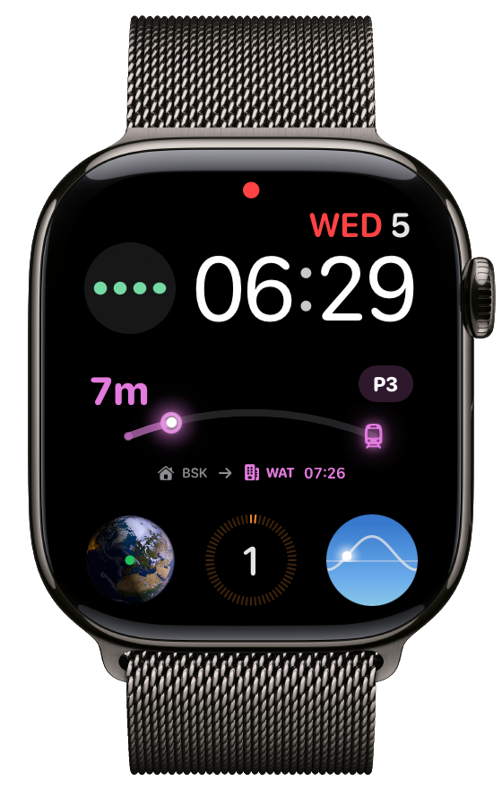
In the watch app, the complications now visualise how long there is to go until the next train arrives. When building this the question arose, but when did your start waiting? When should the countdown ‘start’ from? Initially I assume a 60 minute countdown so it fit naturally with the circular complication and visualising the number of minutes at a glance. That didn’t feel quite right though, so I changed it start from when the previous train left. If there are multiple trains scheduled then I take an average wait time between trains. So it’s a visualisation of how long you would have had to wait at most. I’m not 100% confident on this, so keen to hear feedback on how useful people find it. For me, I just wanted something that looked a bit nicer if I’m going to have it on my watch face all day. Complication designs for ‘off days’ (when no commute is scheduled) are also improved. If, for some reason iOS (or watchOS) hasn’t updated the widget for a while, it will show a tilde (~) next to the time, to indicate the data is not fresh. You can tap to open the app to get the latest data. This is more likely to occur if you use low power mode on your phone or watch.
iPhone App
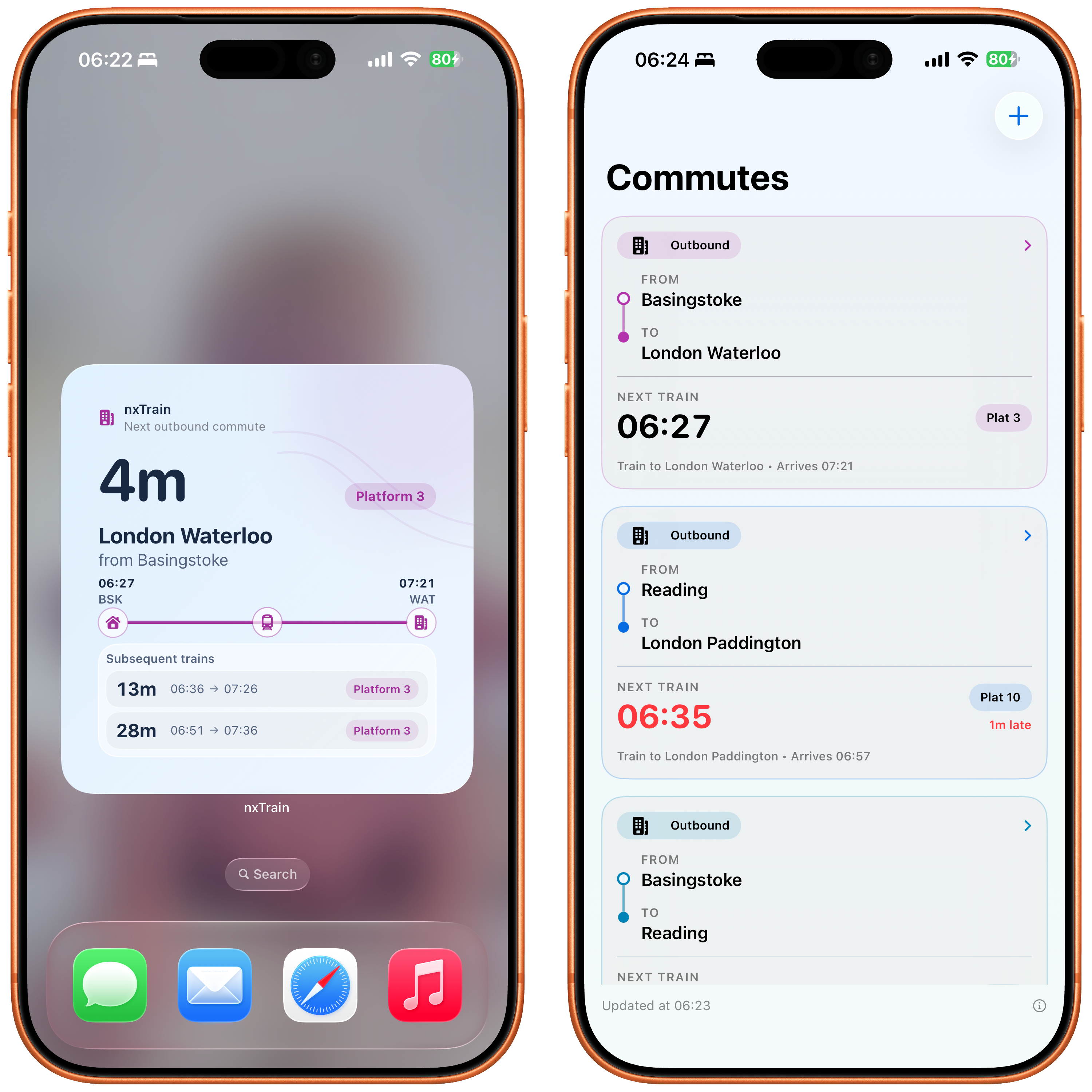
iPhone widgets get a major improve, again with some design applied to them. I should add there is a known bug where the wrong time can be shown if your next train to arrive at your destination isn’t the earliest departure time – I found this about 5 days after I’d submitted to the App Store. Fix incoming.
The app itself has been updated too. The main screen that lists your different commutes now makes it clearer they are different commutes using colours (these colours are also used in widgets and watch complications) and showing the from and to destinations rather than just the destination. This was a result of feedback that the old screen could be confused for a list of journeys within the same commute, especially at the end of a long day when you’re tired just wanted to get home! In the next update you’ll be able to give each configured commute a colour – for now they are set automatically. That update will be coming very soon.
Along with all this there are many general reliability updates.
Also the big news (I’ve buried the lede) - I’ve set the app to be FREE until the end of August. In return, please do me a favour and add a review on the App Store if you find it useful.